How To: Build a pure HTML/CSS Theme Switcher
Switching between light and dark themes is a common feature in modern web applications. While many implementations rely on JavaScript, you can achieve this functionality purely with HTML and CSS. This guide walks you through building a theme switcher with just HTML and CSS using a hidden checkbox and the CSS :has() pseudo-class.
Step 1: The HTML Structure
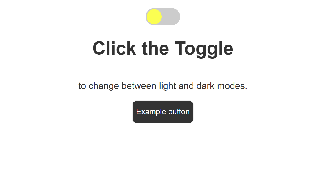
The HTML structure for the theme switcher includes a hidden checkbox, a label styled as a toggle, and some content to demonstrate the theme change.
<div class="content">
  <!-- Start theme toggle -->
  <!-- Hidden checkbox for toggling theme -->
  <input type="checkbox" id="theme-toggle">
  <!-- Toggle label, the part we see -->
  <label for="theme-toggle" class="toggle-label"></label>
  <!-- End theme toggler -->
  <!-- Content -->
  <h1>Click the Toggle</h1>
  <p>to change between light and dark modes.</p>
  <button>Example button</button>
</div>
Key Points:
- The
inputcheckbox is hidden from view (display: none) but serves as the control for the toggle. - The
labelelement is styled to resemble a switch and toggles the checkbox state when clicked.
Step 2: The CSS Styling
The CSS handles: 1. The base styles (light theme). 2. The appearance of the toggle. 3. The dark theme styles applied when the checkbox is checked.
/* Base styles for light theme */
body {
  font-family: Arial, sans-serif;
  background-color: #ffffff;
  color: #333333;
  transition: background-color 0.3s ease, color 0.3s ease;
}
/* Center content */
.content {
  display: flex;
  flex-direction: column;
  align-items: center;
  margin-top: 20px;
}
button {
  background-color: #333333;
  color: #fff;
  border: 1px solid #f0f0f0;
  border-radius: 8px;
  height: 40px;
  cursor: pointer;
}
button:hover {
  background-color: #d0b5dd;
  color: #333333;
}
/* Hidden checkbox */
#theme-toggle {
  display: none;
}
/* Toggle label */
.toggle-label {
  cursor: pointer;
  width: 60px;
  height: 30px;
  background-color: #ccc;
  border-radius: 30px;
  position: relative;
  transition: background-color 0.3s ease;
}
/* Circle inside the toggle */
.toggle-label::after {
  content: "";
  width: 26px;
  height: 26px;
  background-color: yellow;
  border-radius: 50%;
  position: absolute;
  top: 2px;
  left: 2px;
  transition: transform 0.3s ease;
}
/* Dark theme styles */
body:has(#theme-toggle:checked) {
  background-color: #333333;
  color: #ffffff;
}
body:has(#theme-toggle:checked) .toggle-label::after {
  background-color: #4b89e6;
}
body:has(#theme-toggle:checked) .toggle-label {
  background-color: #666;
}
body:has(#theme-toggle:checked) button {
  background-color: #fff;
  color: #333333;
}
body:has(#theme-toggle:checked) button:hover {
  background-color: #b5ddc1;
  color: #333333;
}
body:has(#theme-toggle:checked) .toggle-label::after {
  transform: translateX(30px);
}
Explanation:
- Base Styles: Define the default light theme.
- Transition Effects: Smoothly animate theme changes using
transition. - Dark Theme: Utilize
:has()to apply styles when the checkbox is checked.
Step 3: How It Works
- The hidden checkbox (
#theme-toggle) toggles its state when thelabelis clicked. - The
:has()pseudo-class detects when the checkbox is checked and applies the dark theme styles to thebody. - All transitions ensure the theme change is smooth and visually appealing.
Demo and Customization
You can experiment with the toggle styles by adjusting the label and ::after pseudo-element. For example:
- Change the size of the toggle by modifying the width and height of .toggle-label.
- Customize the dark theme colors to suit your design needs.
Conclusion
Creating a theme switcher with just HTML and CSS is a great way to keep your codebase simple and efficient. By leveraging modern CSS features like :has(), you can achieve powerful interactions without JavaScript.
Feel free to customize this implementation to fit your project’s aesthetic and functionality!